Updated – May 28, 2026
Fluid Fixed Grid code is simple and fast. It's not a bloated system using JQuery or heavy JavaScript, or complex HTML and CSS. It's a simple universal HTML, CSS and JavaScript framework that can be used to create almost any layout you want with ease and speed. In fluid web design, the widths of page elements are set proportional to the width of the screen or browser window. A fluid web design expands or contracts based on the width of the current viewport. A fluid design helps make websites more usable across device types with varying screen dimensions.
The Fluid Fixed Grid code is built similarly to the widely used grid frameworks currently used for websites. This framework is more or less the same as any responsive framework online today with the addition of added fluid logic. Styles are standard and created with the best of all the grid systems to improve the best chance possible of a contiguous site design across all mobile devices, tables, all browsers(IE, chrome, firefox, safari, opera), etc.
Flexible, Flexible, Flexible
Internet users use the internet with devices of varying screen sizes and resolutions more than ever before. In the past we coded a page to 'try to capture' the most viewers possible and left out the rest of the viewers. Now users use mobile phones, notebooks, tablets, as well as desktops to access your web site. With responsive, fluid layouts we pay attention to how websites look on all of these devices with the same HTML. A responsive website is one that uses different CSS to change its layout to the the device calling the page.
Mobile First Code
It's a good idea to start with the mobile layout and work your way up to the desktop version and that is how Fluid Fixed Grid has been created. Typically desktop layouts are more complex than their mobile counterparts, and this “mobile-first” approach maximizes the amount of CSS that you can reuse across your layouts. There are times when it is advantageous to add additional HTML an hide or show content from certain devices as needed. This is a common design practice of the mobile first design approach. Various code options are common in navigations when you want a button to open the navigation on a mobile device, and you want the navigation to display at all times on a desktop.
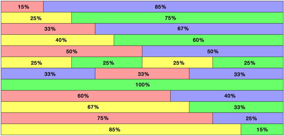
Responsive, Fluid Code
The responsive layout starts with rows and columns. The columns must total 100% for best results. You can use smaller columns and add whitespace to achieve 100% as well. It is easy to draw boxes around your page's design to see which rows and columns you need to use to design your page. Once you learn how the responsive layout works you'll start to know which designs fall into the responsive layout structure. Some areas can be full Fluid and other areas can be Responsive to create the layout you want for different screen sizes.